Framed Goods: Why UK Sleeve Art Is Becoming the Scene’s New Talent Radar
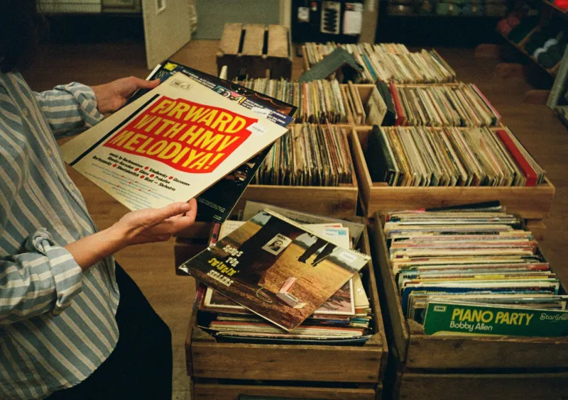
Walk into any half-decent UK soul night in 2026 and you’ll notice something beyond the horns, the 45s and the queue at the bar. People are talking about the sleeves. Not just the rare ones, either. New 7-inches, limited runs, hand-numbered gatefolds — the artwork is getting a proper look-in, and it’s changing how younger fans find their way into the scene.
For years, the visual side of UK funk and soul felt like a bonus. You bought the record for the tune, the label, the DJ or the bassline. The sleeve was nice if it was nice. Now, with physical releases competing against an endless digital feed, a distinctive cover is doing the job a gig flyer or a radio plug used to do: it’s a signal. It says someone cared enough to make the whole object feel intentional.
The 7-inch as a calling card
Small labels have clocked this. A hand-drawn sleeve on a 7-inch is cheap-ish to produce in a short run and it travels well — into record bags, onto Instagram, across the counter at an independent shop in Bristol or Leeds. It also gives a new artist a visual identity before they’ve got a press photo budget.
“You can hear a record once and forget it,” says one South London screen-printer who works with soul and funk labels. “But if the sleeve sticks in your head, you’ll pick it up again. That’s the whole game.”
The results are all over the racks: felt-tip lettering that looks like a 1970s library-music cover, risograph prints with visible misregistration, hand-stamped centre labels, sleeves that fold out into posters. None of it is trying to look expensive. Most of it is trying to look like it belongs to the record.
That matters in a scene where authenticity gets talked about to death. A sleeve doesn’t have to be vintage to feel right. It just has to feel connected to the music — a bit rough, a bit personal, not designed by committee.
From bedroom studio to gallery wall
A curious side effect: people are framing the things. Not just rare originals, but new releases. A limited Brit-funk reissue with a screen-printed outer sleeve can end up on a wall in a flat in Manchester as easily as in a DJ bag. That’s partly because the artwork is being made with that in mind — bolder shapes, fewer fussy details, colours that hold up at 12 inches square.
Illustrators are also borrowing from outside the record shop. You’ll see textile patterns, old club flyers, dancefloor typography, even the kind of geometric abstraction that used to live on jazz-fusion sleeves. The best of it doesn’t feel like pastiche. It feels like a UK visual language: a bit DIY, a bit pop, and deeply aware of the past without being trapped by it.
Small labels are using this to tell stories, too. A gatefold reissue can carry liner notes, session photos and credits that were lost the first time around. A new 7-inch can include a fold-out zine. The sleeve becomes a place to put the context that streaming can’t hold.
The economics of a beautiful record
None of this is free. Screen-printing costs money, hand-numbering takes time, and a limited gatefold is a gamble when pressed vinyl is already expensive. But the economics are shifting. Pre-orders reward a strong visual pitch. A record that looks good is easier to post about, easier to stock in a small shop, easier to remember at the end of a long dig.
That’s why you’re seeing more collaborations between labels and illustrators rather than generic stock imagery. It’s also why some artists are treating the sleeve as part of the release, not an afterthought. If you’re pressing 300 copies, you want every one of them to feel like an object someone will keep.
There’s a risk, of course. Sleeve art can become a substitute for substance, and a pretty cover won’t save a weak tune. But in a scene this rooted in physical culture, the visual and the sonic were never really separate. The best funk and soul records have always had a bit of theatre about them. The new wave is just making that theatre more visible — and more frameable.
What to watch on the racks
Keep an eye on hand-numbered runs from small UK labels, especially those working with screen-printers or illustrators directly. Look for sleeves that credit the designer, not just the artist. Check the back of the record: if there’s a fold-out insert, a zine or a set of liner notes, that’s a clue someone is thinking about the whole package.
And don’t overlook the cheap stuff. A well-designed 7-inch from a new artist can be just as striking as a glossy reissue. The point isn’t rarity. It’s intent. In 2026, the sleeve is one of the clearest ways to spot it.
For a scene obsessed with how things sound, that’s a healthy development. The ears still lead. But the eyes are getting a say — and the walls of UK soul fans are all the better for it.